At first glance, stock charts may seem like an incomprehensible array of lines, numbers, and terms. However, these charts are invaluable tools for investors seeking to gauge a company’s performance over time. Whether you are evaluating potential investments, or understanding economic trends, how to read stock charts is an essential skill.
This article will simplify stock charts, helping you understand their components, read various chart patterns, and apply this knowledge effectively. While past performance can provide insights, it does not guarantee future results.
Understanding the Basics of Stock Charts
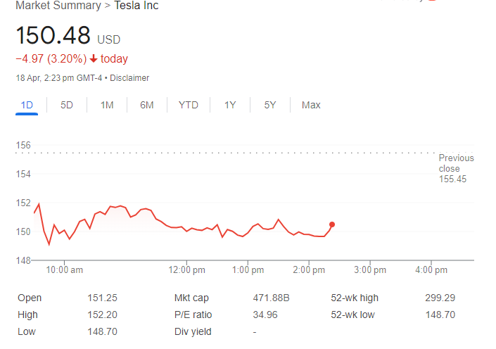
The first step in learning how to read stock charts is to familiarize yourself with the basic components. A standard stock market graph provides a visual representation of a stock’s price movements within a specific timeframe, often referred to as a price chart. The horizontal axis (x-axis) denotes time, while the vertical axis (y-axis) indicates price levels. The most common element you’ll encounter is the price line, which tracks the changes in the stock’s price over a selected period.
Stock charts can vary in complexity, but most include several common elements:
Open, High, Low, and Close: These terms reflect the stock’s price dynamics within a trading day.
‘Open’ is the price at the market’s opening, ‘High’ is the highest price of the day, ‘Low’ is the lowest price of the day, and ‘Close’ refers to the price when the market closes. These points are essential for understanding daily price movements and are often represented in a bar or candlestick format. A price bar helps traders understand the price range of each period and fluctuates in size based on market volatility.
Volume: This indicates the number of shares traded during a given period and is crucial for understanding the strength behind price movements.
Market Cap (Mkt cap): It shows the total value of all a company’s shares of stock. It is calculated by multiplying the current market price of one share by the total number of shares.
PE Ratio and Dividend Yield: These metrics help assess a stock’s investment potential. The PE ratio compares a stock’s price to its earnings per share, providing information about its relative valuation. The Dividend Yield is a financial ratio that shows how much a company pays out in dividends each year relative to its stock price.
Understanding these elements helps you grasp the basic dynamics of stock charts.
For instance, if a stock closes higher than it opened, the day is considered bullish (positive). Conversely, if it closes below its opening price, the day is bearish (negative).
Types of Stock Charts
Stock charts are essential tools for investors and traders to analyze historical data and make informed decisions. Here’s a detailed explanation of the three common types of stock charts:
Understanding different types of stock charts is crucial for identifying trading chart patterns, which can help uncover new trading opportunities.
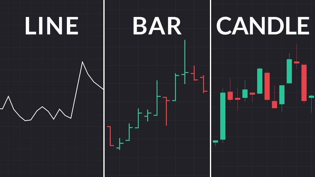
1. Line Charts
Line charts are the most straightforward type of stock chart. They represent the closing prices of stocks over a specified period. Each point on the chart corresponds to the closing price of the stock on a particular day, and these points are connected by a line.
This type of chart is particularly useful for identifying long-term trends in stock prices, as it clearly shows how prices have moved over time. However, because it only includes closing prices, it may overlook intraday price fluctuations that could be crucial for short-term trading decisions.
Line charts can also help in identifying the prevailing trend over a long period, which is essential for understanding market behavior and price patterns.
2. Bar Charts
Bar charts provide a more comprehensive view compared to line charts. Each bar on a bar chart represents trading data for a single day (or another specified period) and shows the opening price (the left horizontal line), the closing price (the right horizontal line), the high price (the top of the bar), and the low price (the bottom of the bar) of the stock.
This type of chart is valuable because it offers insights into the volatility and trading range for each period, which can be vital for understanding market sentiment and potential price directions.
Additionally, bar charts can be used to identify support and resistance lines, which are crucial for setting take profit and stop-loss orders in trading strategies.
3. Candlestick Charts
Candlestick charts are similar to bar charts in the data they provide but offer a more visually intuitive format.
Each “candlestick” represents a period’s trading data. The main body (the wider part) of the candlestick shows the opening and closing prices. If the close is higher than the open, the body is typically colored white or green, representing a price increase. If the close is lower than the open, the body is usually black or red, indicating a price decrease. The lines protruding from the body (“wicks” or “shadows”) display the high and low prices for the period.
Candlestick charts are favored by many traders because the color-coding and visual distinctions make it easier to spot trends and reversals in price action. They are also useful for identifying reversal patterns, which signal a change in the prevailing trend.
Choosing the Right Chart for Technical Analysis
The choice of which stock market graph to use can depend on several factors:
- Investors looking at long-term trends might prefer line charts, while traders making quick, frequent transactions may benefit from the additional details in bar or candlestick charts.
- Beginners may find line charts easier to interpret, whereas more experienced traders might utilize the detailed information in candlestick charts.
- Detailed analysis involving open, high, low, and close prices naturally leans towards bar or candlestick charts.
Each type of chart offers different advantages, so the choice often comes down to personal preference and specific needs for data visualization in the context of stock market analysis. Technical analysis is essential for making informed decisions when choosing the right chart for stock market analysis.
Essential Chart Patterns to Know About
Once you get the hang of basic stock charts, you will start to notice some interesting shapes that can give you clues about where the market might be heading next.
Here are a few common chart patterns to watch for:
Head and Shoulders: This one looks just like it sounds—there is a high peak (the head) with two lower peaks (the shoulders) on either side. It usually pops up when a trend is about to flip like the market gearing up to switch from climbing to falling. This is a classic example of a bearish pattern, indicating a downward trend in prices.
Cup and Handle: Imagine a teacup in your chart. The cup is a smooth U-shape recovery from a drop, and the handle dips slightly before the price heads back up. This pattern suggests that the stock’s good run is not over yet and might climb higher.
Double Top and Bottom: These patterns show up when the price hits a high or low twice but can’t break through. A double top is a sign that prices might start dropping, while a double bottom could mean prices are about to rise.
Triangle Patterns: These can be ascending, descending, or symmetrical. They show the tightening of price ranges and often lead to a breakout.
Flag and Pennant: These short-term patterns look like small rectangles (flags) or triangles (pennants) after a big price movement, hinting at another potential sprint in the same direction. These are known as continuation patterns, signaling a temporary interruption of an existing trend before it continues in the same direction.
![trading-charts-1-1448×2048.webp [webp-to-jpg output image]](IMAGE 1)
How to Read Stock Charts: Step-by-Step
1. Identify the Trend
The first step in learning how to read stock charts is to identify the trend. A trend is the general direction of the stock’s price movements over time. A stock can be in an uptrend, downtrend, or sideways trend. To identify a trend, look for a series of higher highs and higher lows in an uptrend, and a series of lower highs and lower lows in a downtrend. In a sideways trend, the stock’s price moves within a narrow range over time.
2. Look for Chart Patterns
Chart patterns can give you a hint about what might happen next with the prices. Look at how prices have moved within specific periods – are there sudden jumps or gradual changes? For instance, a ‘cup and handle’ pattern might suggest a bullish continuation.
3. Analyze the Volume
Volume is a great validator of how strong a particular price movement is. High volume during a price increase suggests strong buying interest, which might indicate a continuation of the trend.
4. Use Indicators
Several technical indicators can help refine your analysis when learning how to read stock charts. Popular ones include:
- Moving Average: It is a trend-following indicator that calculates the average price of the stock over a specific time period.
- RSI (Relative Strength Index): Measures the speed and change of price movements.
- MACD (Moving Average Convergence Divergence): An indicator that helps determine trend direction and momentum.
Those who have mastered basic stock chart analysis can utilize more complex charting techniques like Elliott Wave Theory or Fibonacci retracements.
5. Combining Tools and Techniques
No single method or tool is foolproof when analyzing stock charts. The best approach is to combine various tools and techniques to validate your trading decisions. Moreover, factors like economic indicators, industry performance, and political events can significantly affect stock prices and should be considered when analyzing charts.
Conclusion
Learning how to read stock charts is like acquiring a new language. It takes time and practice but becomes incredibly rewarding as you gain fluency. By starting with the basics, gradually building up your knowledge of chart patterns, and regularly practicing your skills, you will enhance your ability to make informed decisions in the stock market.
Remember, while stock charts are powerful tools, they are just one part of a comprehensive investment strategy. Always consider multiple factors before making any investment decisions.